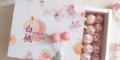
Typography isn’t limited to books and websites; it plays a significant role in gift box design too. In this article, we’ll delve into the world of typography and how it shapes the perception of gift boxes.
Font Choice: Different fonts evoke distinct emotions. Playful fonts exude a sense of fun, while elegant serif fonts convey sophistication. Choosing the right font sets the tone for the entire unboxing experience.
Size and Placement: The size of the text and its placement on the gift box contribute to its visibility and impact. Bold, large typography can make a powerful statement, while delicate and small text can add an element of subtlety.
Brand Identity: Typography in gift box design is a reflection of brand identity. Consistent use of fonts across packaging and branding materials helps establish a recognizable and cohesive image.
Personalization: Customizing gift boxes with the recipient’s name or a special message using typography adds a personal touch that enhances the emotional connection between the giver and the receiver.
Contrast and Readability: Good typography considers readability. The contrast between text and background ensures legibility, especially in cases of intricate designs or dark backgrounds.
Conclusion: Typography is a silent communicator that speaks volumes. The choice of font, size, and placement can influence how gift boxes are perceived and contribute to the overall aesthetic appeal of the packaging.


